
Splunk contains various visualizations allowing you to create charts and dashboards based on the imported data, and for your consideration we have included a range of example below.
In the following examples we have used the variable <INDEX_NAME> to indicate the name of your index used by Splunk to store the imported data. If this is the only data stored in Splunk, the index may be left out.
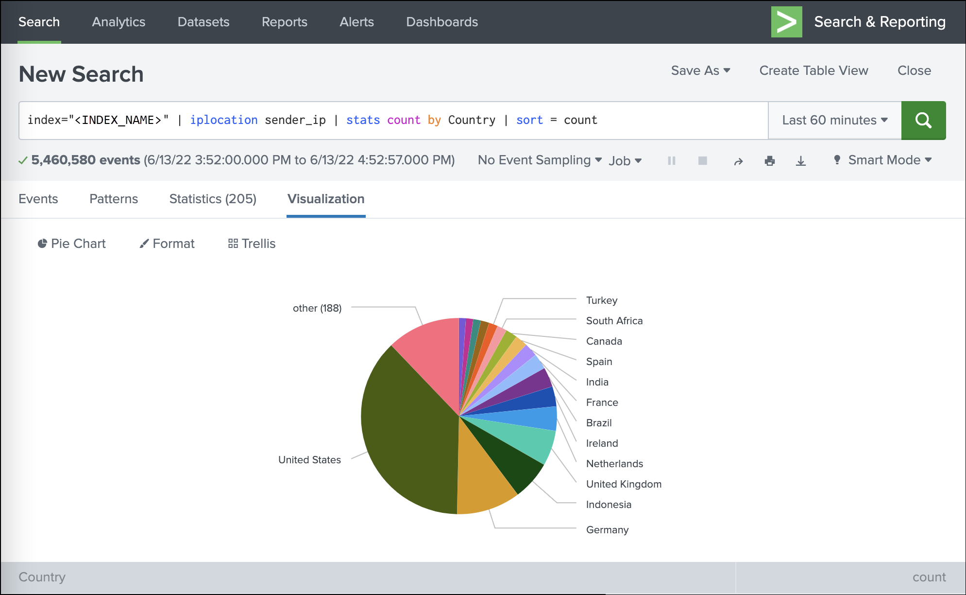
Traffic origins based on the sender IP address
index=<INDEX_NAME> | iplocation sender_ip | stats count by Country | sort = count
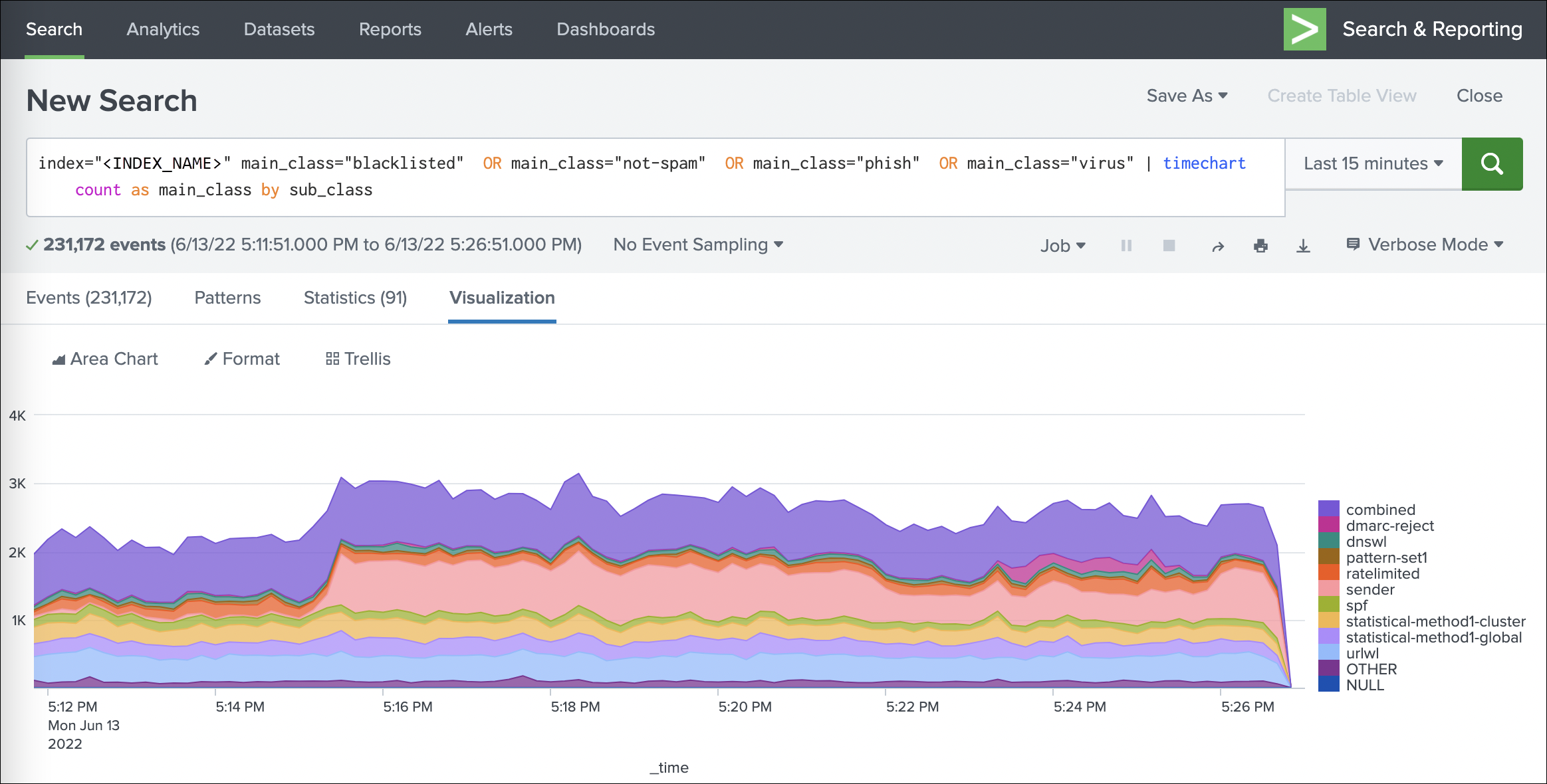
Volume of blocked mail by classification
index="<INDEX_NAME>" main_class="blacklisted" OR main_class="not-spam" OR main_class="phish" OR main_class="virus" | timechart count as main_class by sub_class
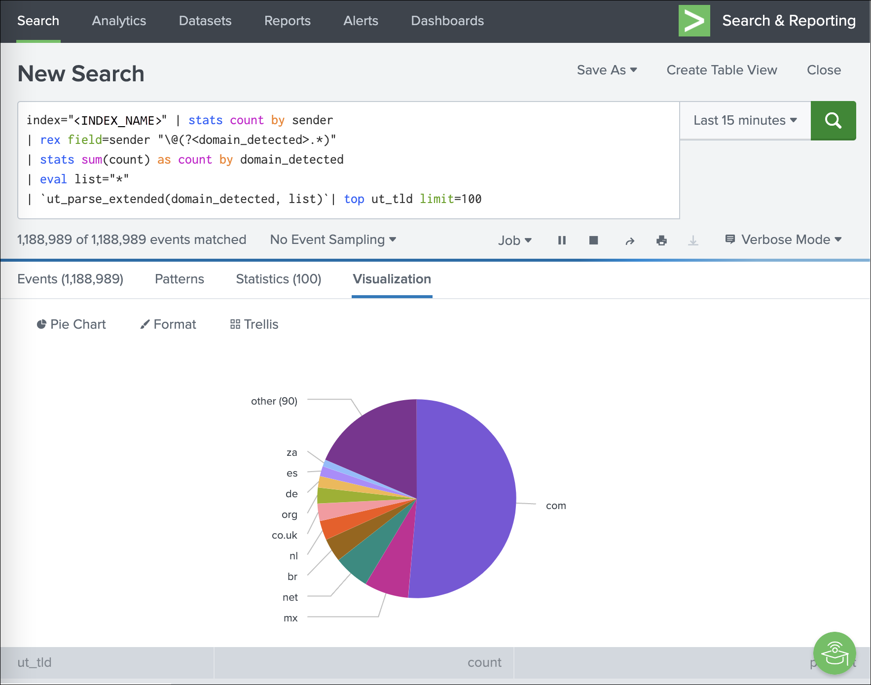
Most common top-level domains across mail
index="<INDEX_NAME>" | stats count by sender
| rex field=sender "\@(?<domain_detected>.*)"
| stats sum(count) as count by domain_detected
| eval list="*"
| `ut_parse_extended(domain_detected, list)`| top ut_tld limit=100
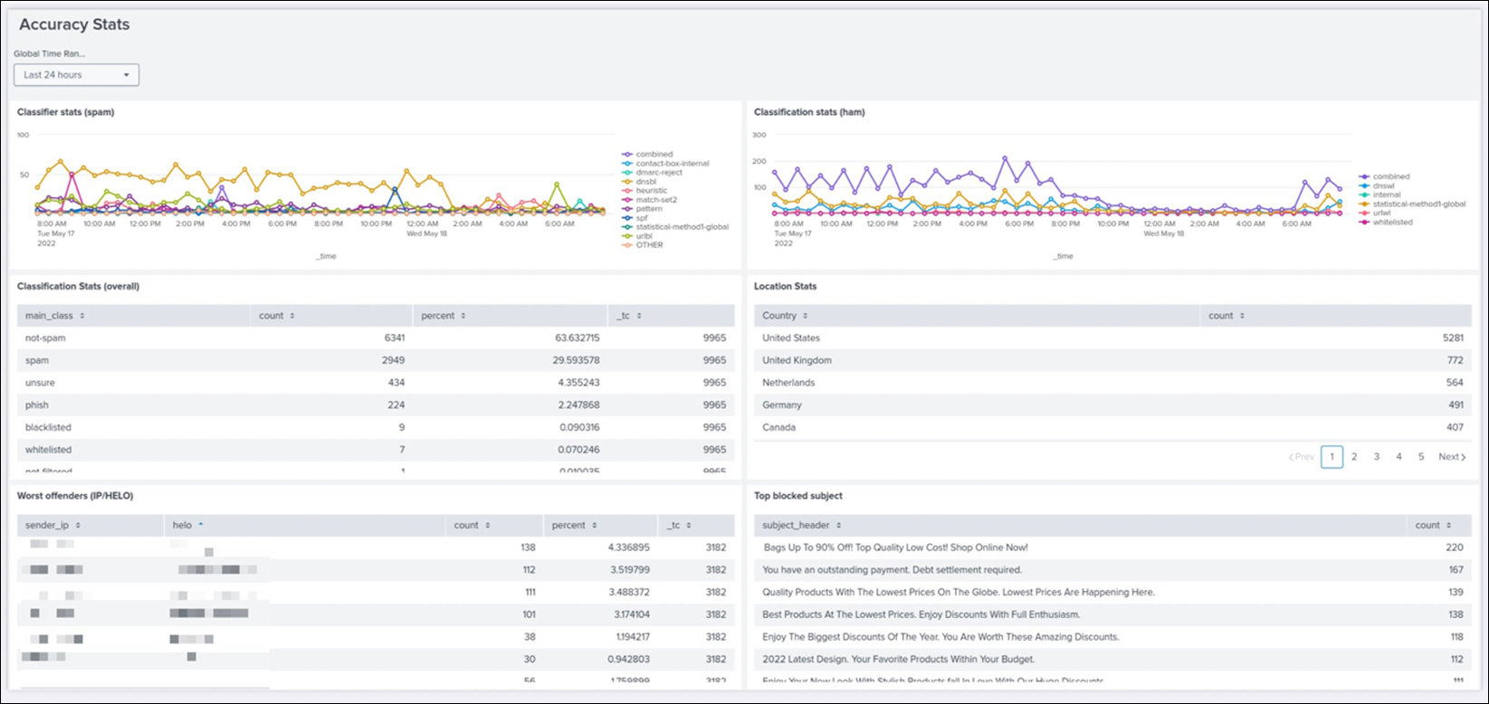
Accuracy Dashboard
In Splunk, you can save queries, generate alerts based on queries, and build dashboards based on the mail data, such as the accuracy dashboard.
Disclaimer: This documentation may contain references to third party software or websites. N-able has no control over third party software or content and is not responsible for the availability, security, or operation, of any third-party software. If you decide to utilize a release involving third-party software, you do so entirely at your own risk and subject to the applicable third party’s terms and conditions of the use of such software. No information obtained by you from N-able or this documentation shall create any warranty for such software.